Supervision: O. Clairouin, C-H. Groult, M. Zerbib, D. Castello-Lopes
Acknowledgements: S. Triky, F. Tissier, S. Lehmann, J. Martorell, C. Montagut
Le Monde, 2018
Project
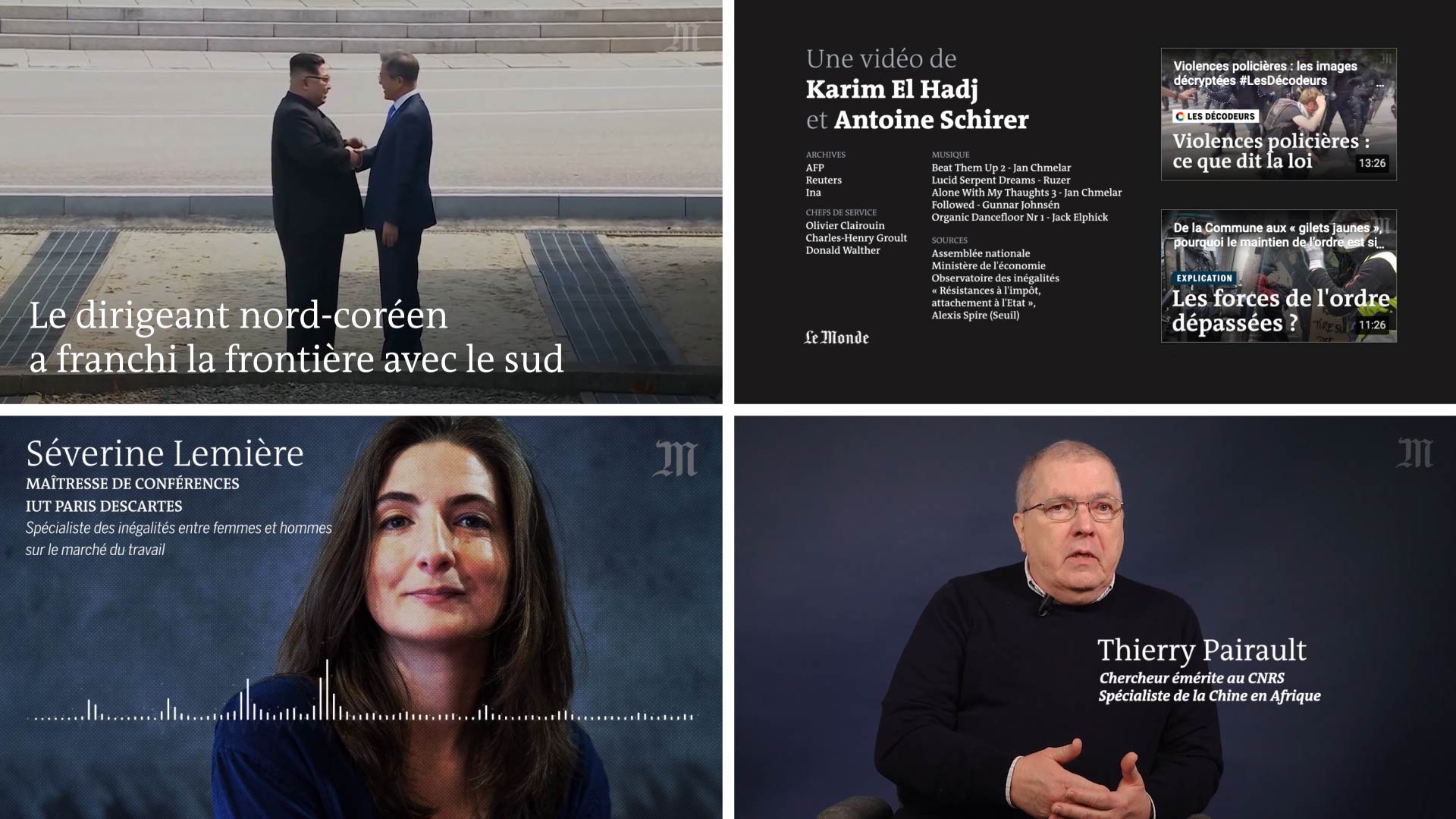
I was asked, in early 2018, to work on a new identity for the video channel. We worked together with designer Elisa Bellanger, and came up with a solution articulated around three key-principles:
– black & white: no main color. And use animation to highlight items,
– serif font: we brought in the reading font of the newspaper,
– minimalist/cut animations

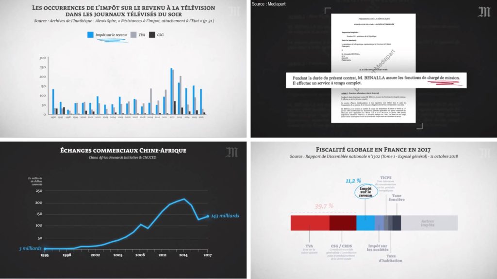
Charts, etc.

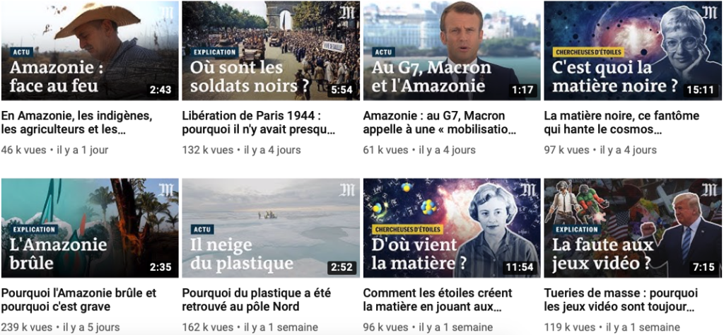
Youtube thumbnails

Integration
I coded and deployed most of the items with the new Adobe feature Essential Graphics. With this toolkit, videojournalists can embed, customize, animate most of the graphics themselves, discharging the design team from a lot of repetitives tasks.
Logo animation
Another challenge on this project was to come up with a modern, fresh logo animation. The title logo, with its gothic font, was not easy to handle. After different attempts, we went for this solution: